

the STORY
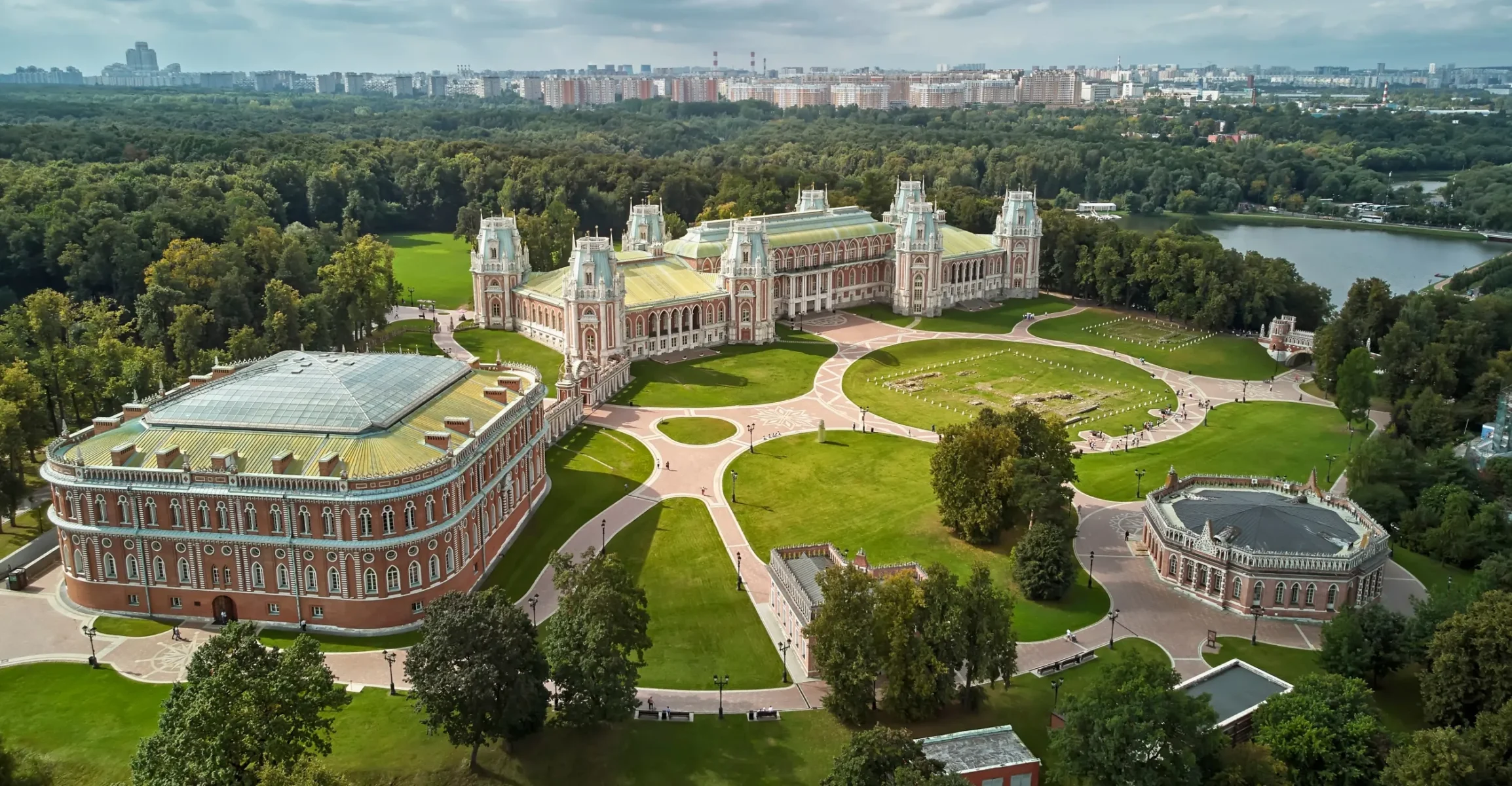
At the Empress’s Residence
The Bread House, venue for the Organ Plus festival, was built in 1785 at Catherine the Great’s country residence near Moscow. In 2008, an organ was installed in its glass-domed atrium, renowned for its exceptional acoustics.
The festival launched in early 2012 with four concerts. By the following year, the lineup expanded to eight performances, and by its third season, the festival adopted a thematic format: the third edition focused on France, the fourth on German music, and the fifth on Austria.
the ELEMENTS
Main Characters
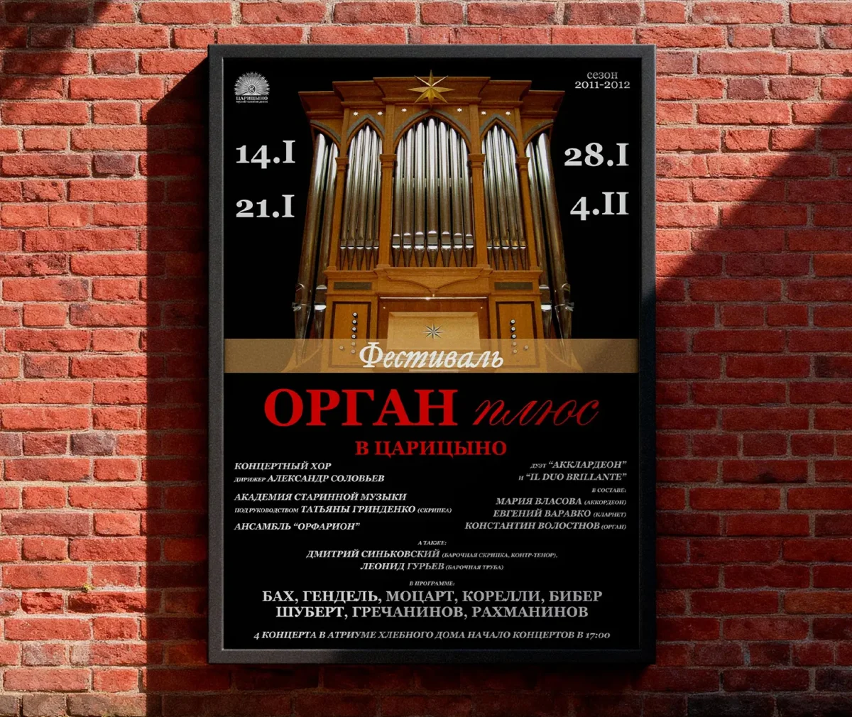
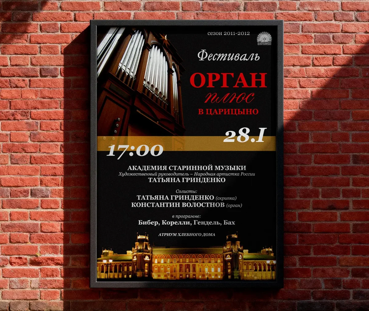
The entire visual identity, much like the festival program itself, revolves around the organ. The first three seasons rely on a contrast of black, red, and white.
The visual focus centers on the organ itself—with its wooden case, silver pipes, and gold star—alongside the Grand Tsaritsyno Palace in its evening illumination.
The name functions like a formula: organ plus choir, orchestra, accordion, vocals, jazz, or spoken word. This defined the core design challenge: creating a recognizable visual system flexible enough to adapt to any lineup.
The logo highlights the words “ORGAN” and “TSARITSYNO”.
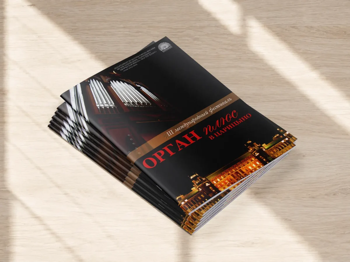
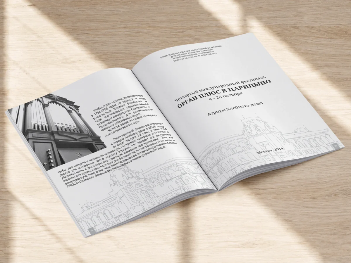
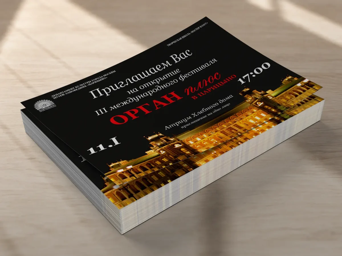
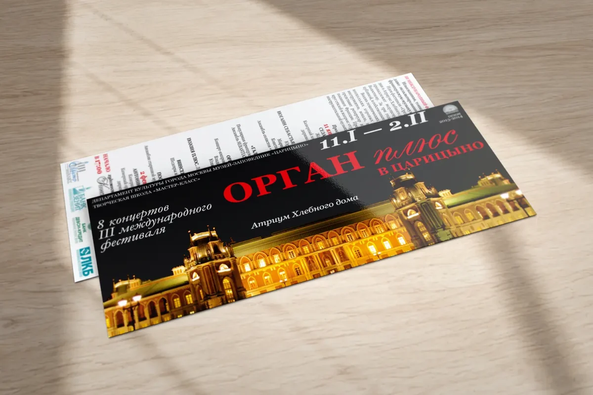
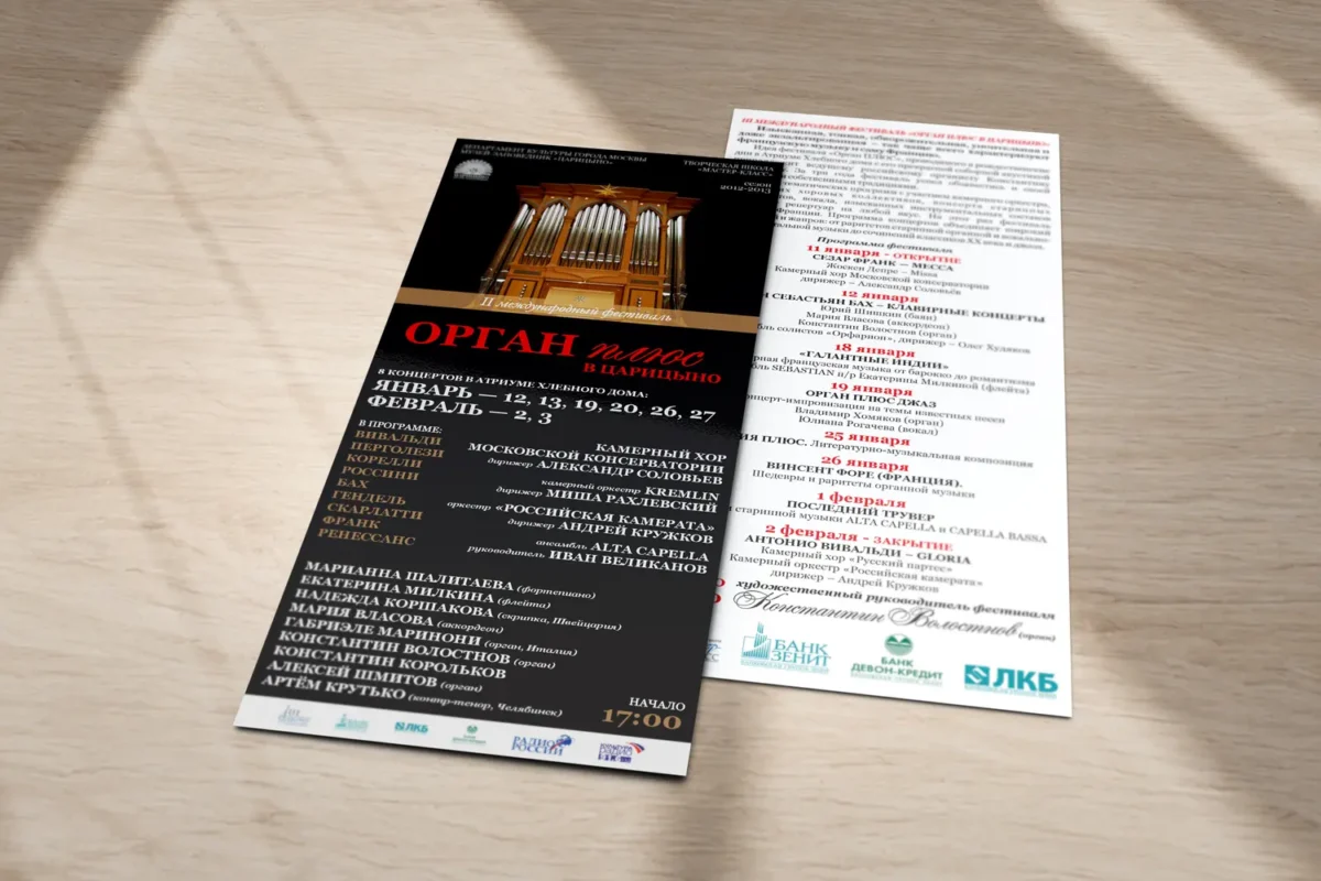
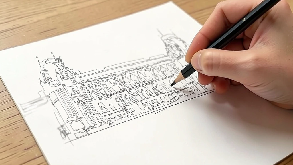
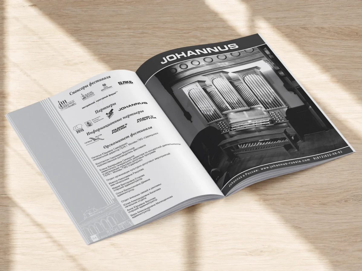
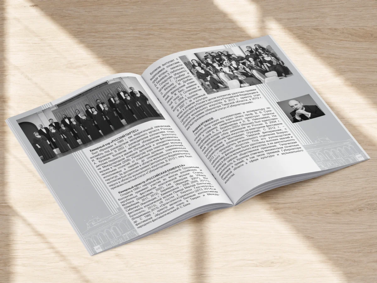
The booklet spreads feature a line-art illustration of the palace in the background, paired with contrasting gray panels and lines that evoke organ pipes.
the REDESIGN
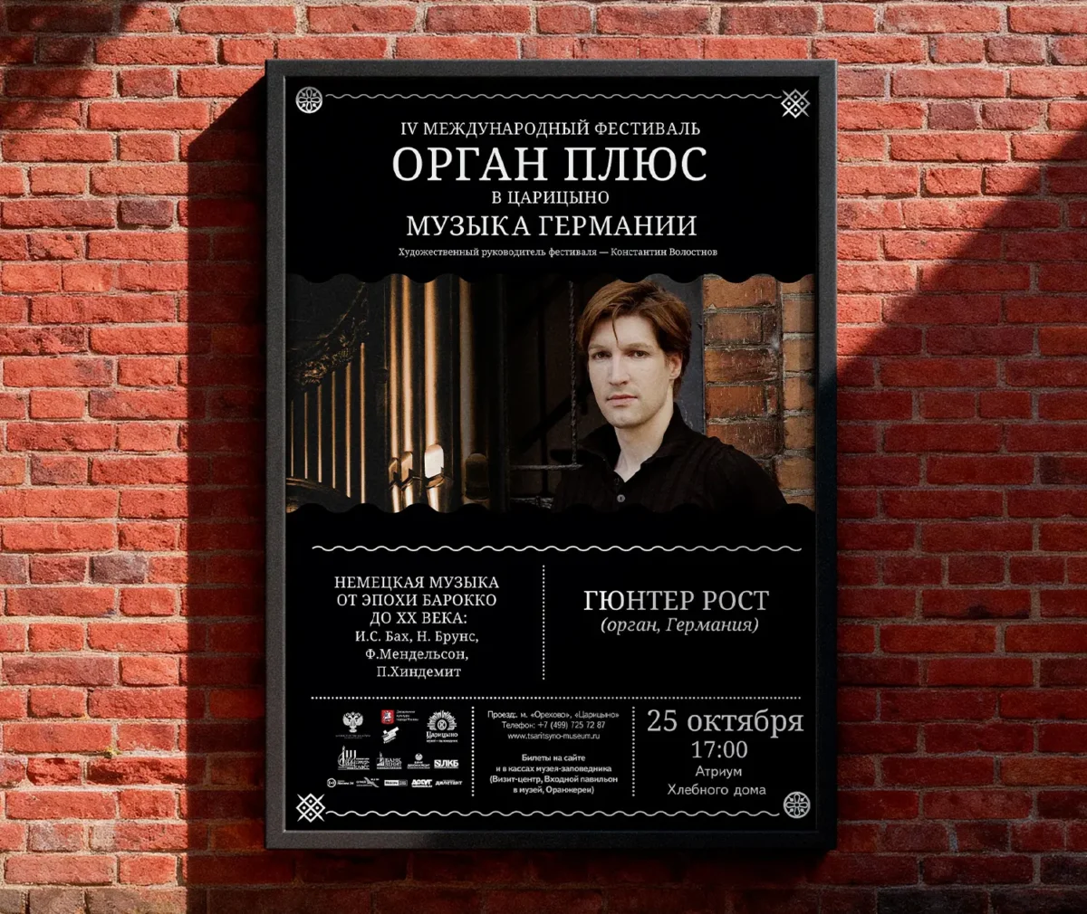
Coming of Age
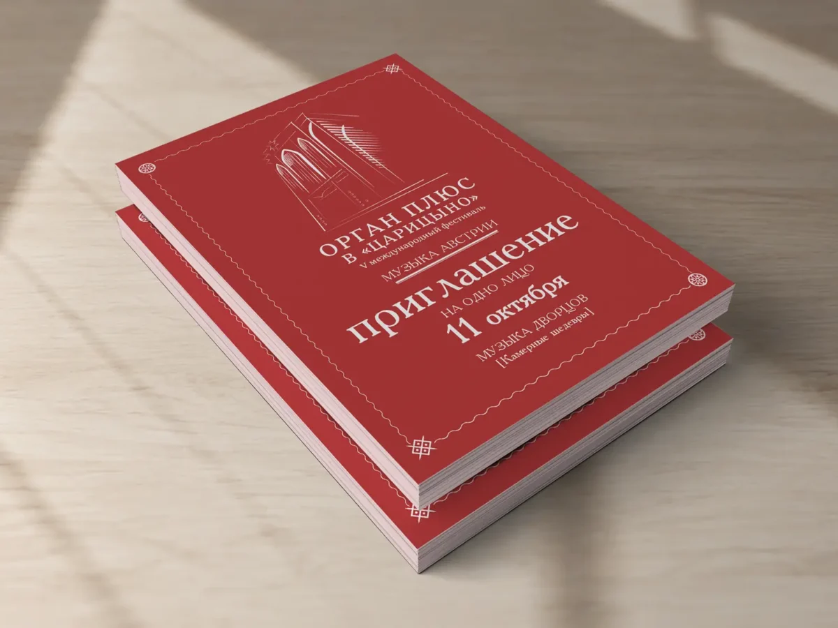
By its fourth season, the festival shifted its visual language. From that point on, the design was developed alongside the Tsaritsyno Museum-Reserve marketing team. Calligraphy gave way to a clean typeface, introducing ornaments and wavy dividing lines.
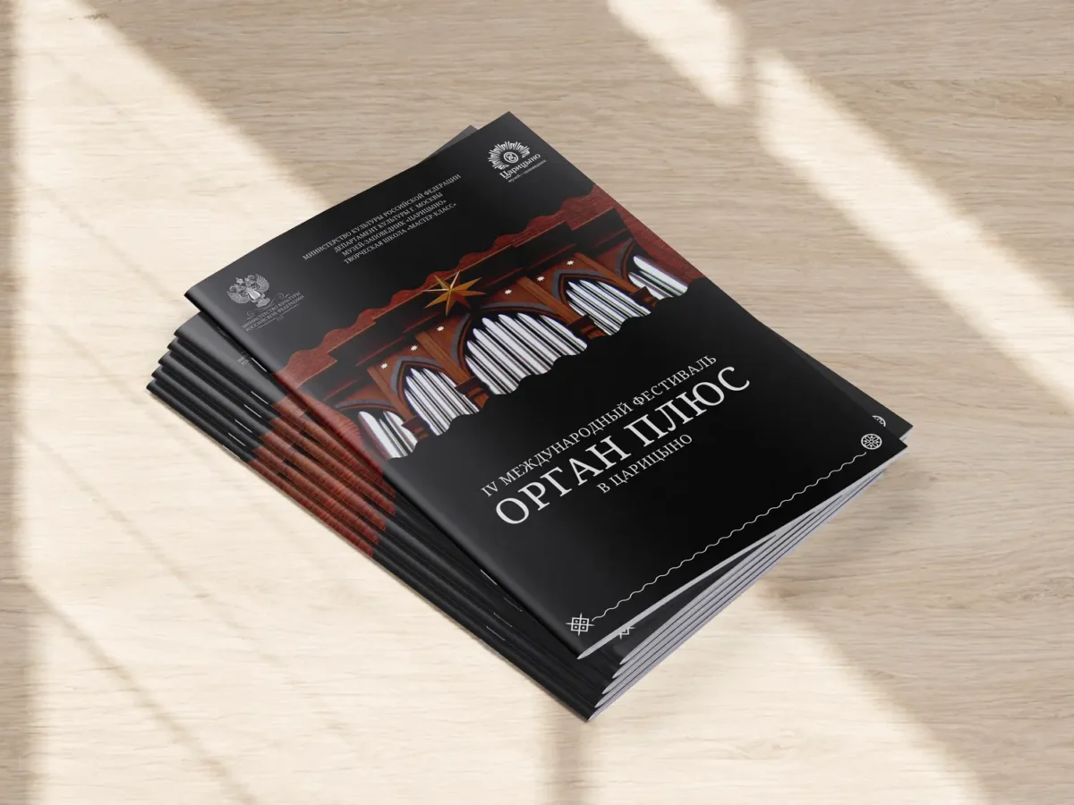
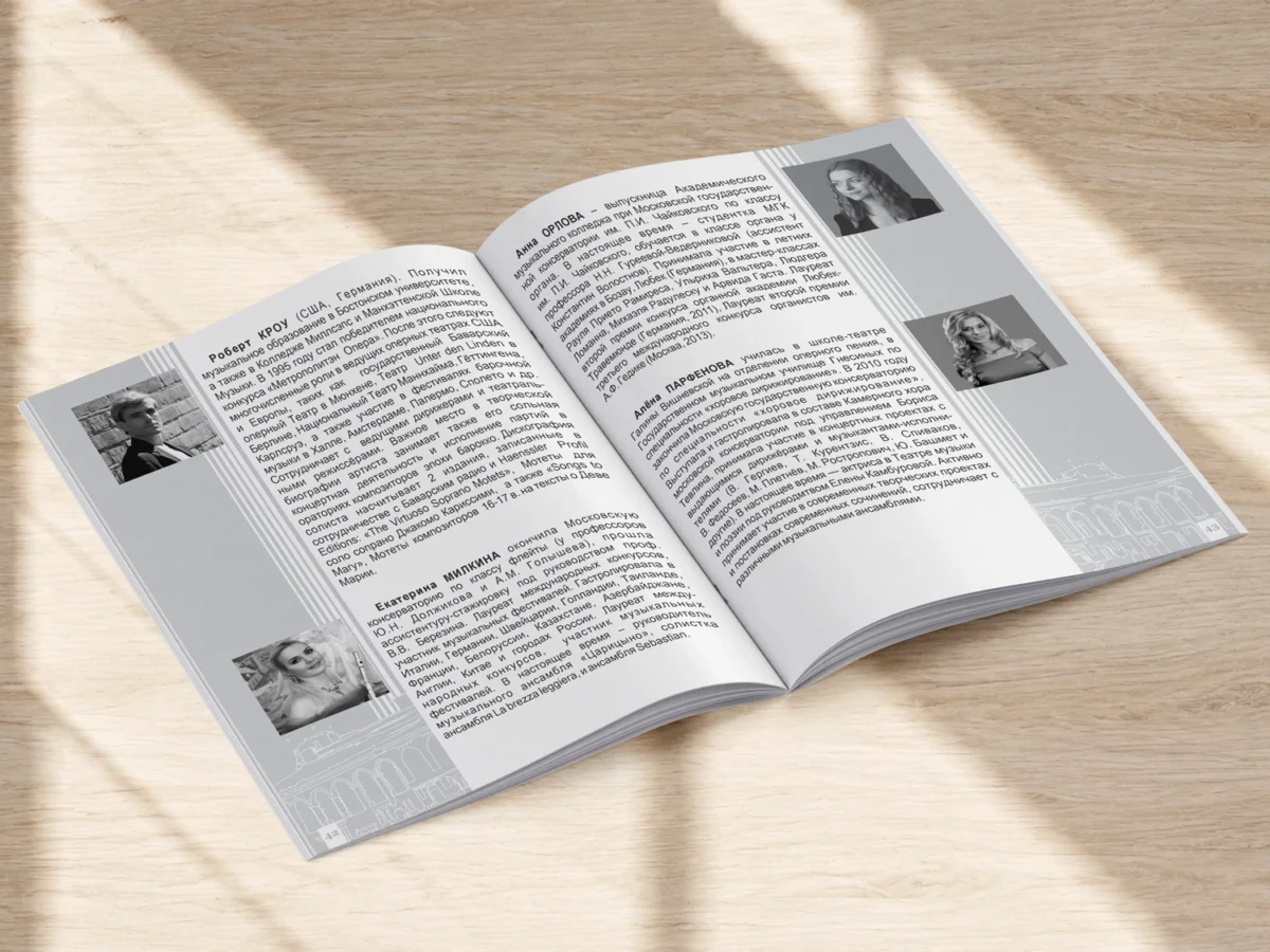
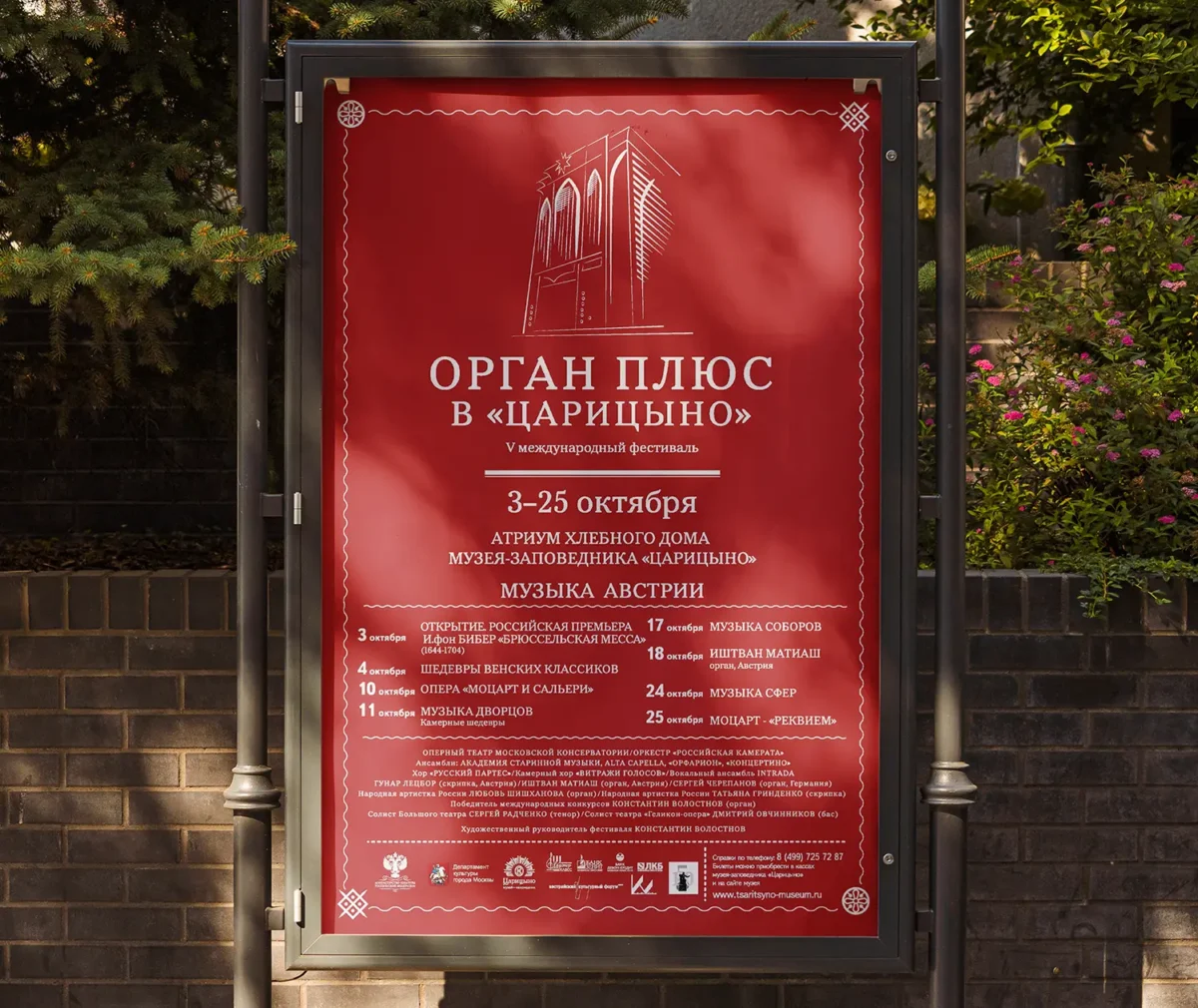
Season Five: Music of Austria
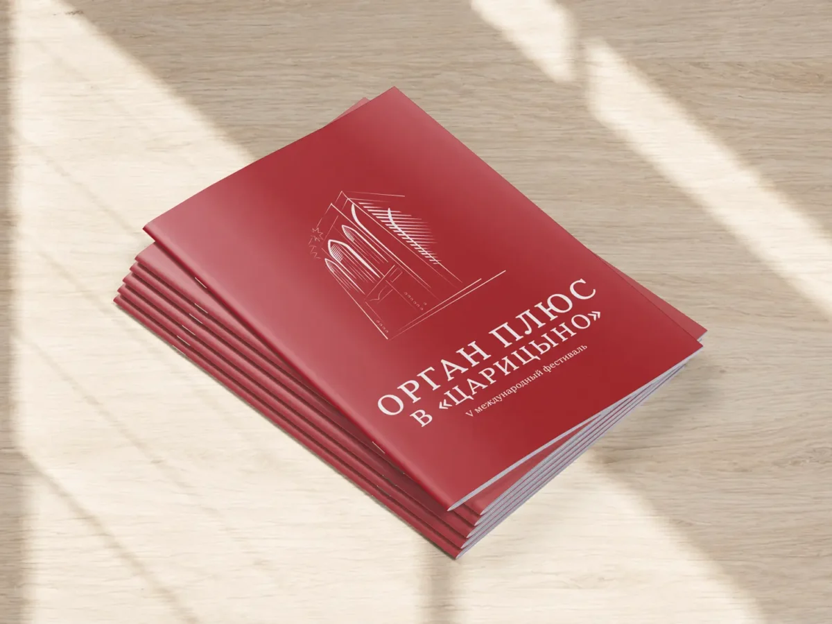
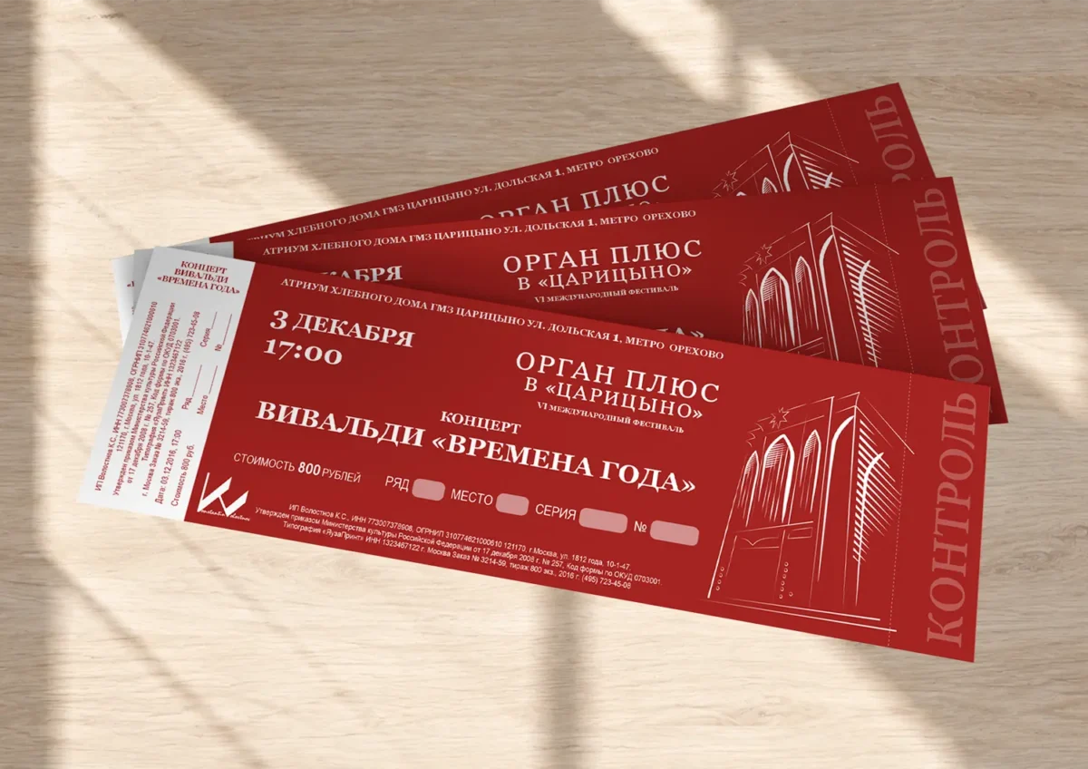
Dark photographic posters made way for bold colors and graphics. A red background, a white line-art illustration of the organ, ornaments, and wavy dividers transformed the design into a vibrant poster.
Season Six: Italy & Spain
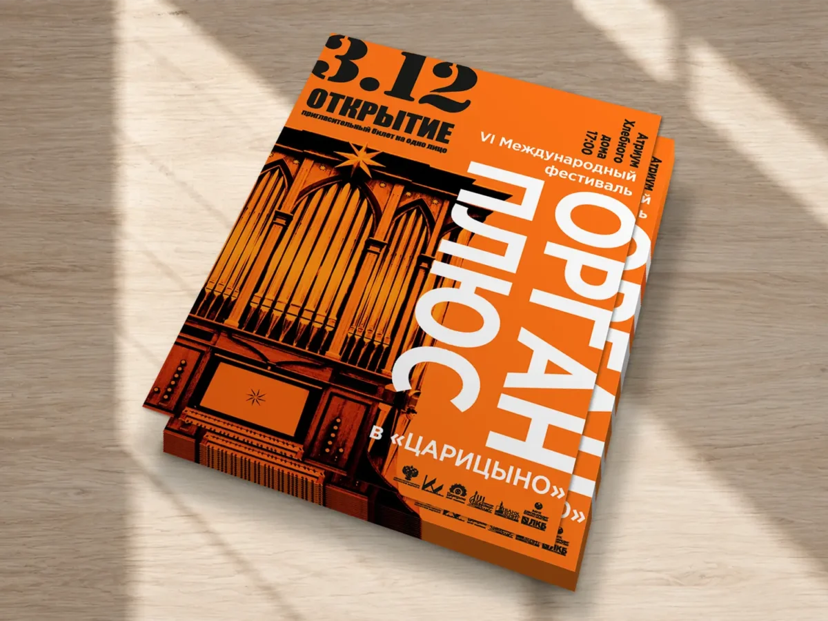
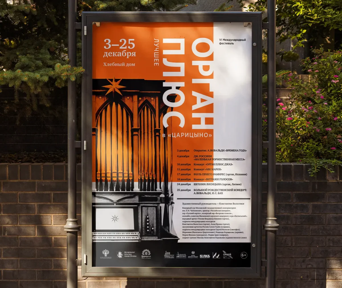
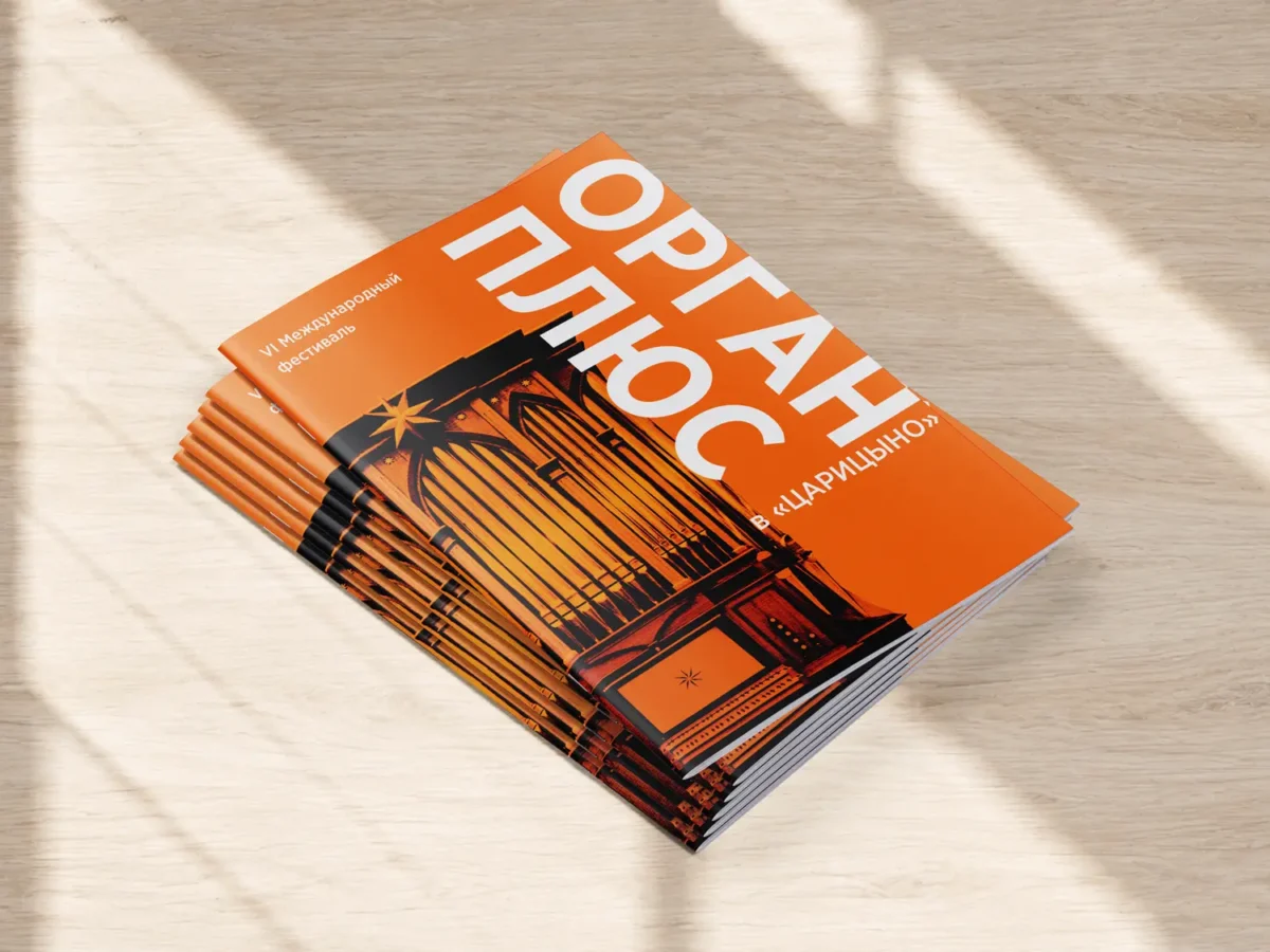
The visual experiments continued: the organ photograph turned orange and black, and the typography became more prominent. Each season’s program booklets mirrored the color palette of the posters.
the BRANDING
Format Adaptation
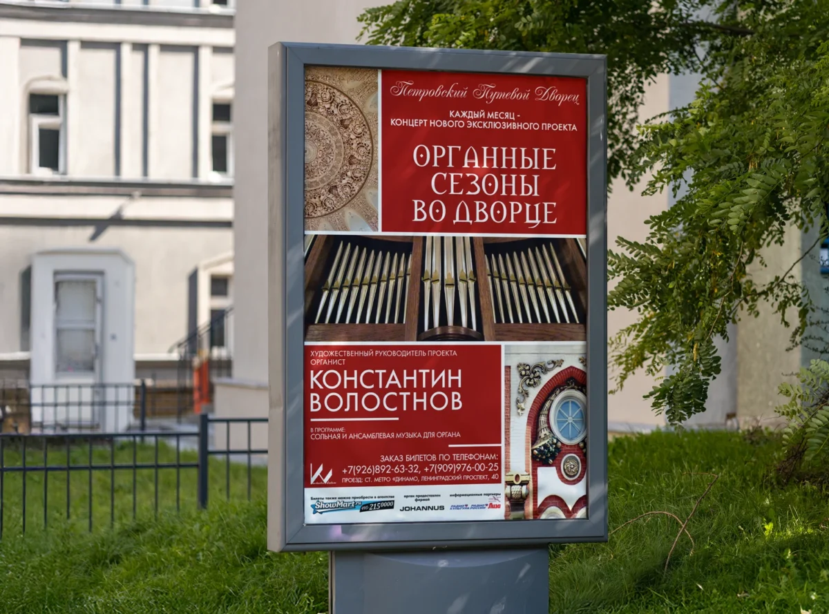
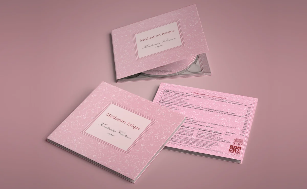
Every season included a main festival poster, individual concert posters, booklets, flyers, banners, invitations, and tear-off tickets.
Over six seasons, the festival’s visual language evolved three times: transitioning from a dark theme with a red logo to an ornamental style, and finally to a vibrant graphic approach. Despite these changes, the identity remained highly recognizable thanks to the signature organ with the star and the “ORGAN PLUS” name.