

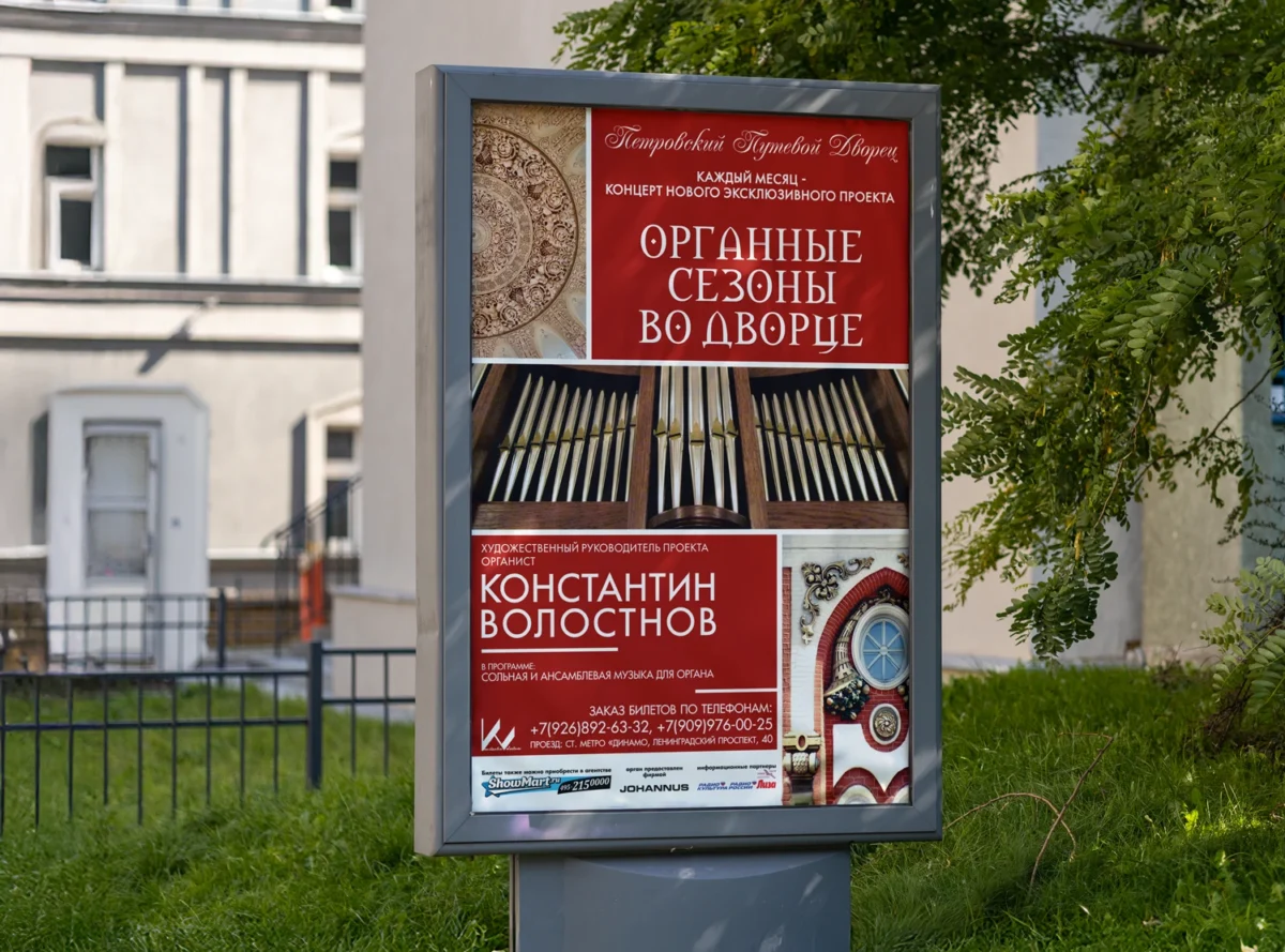
the STORY
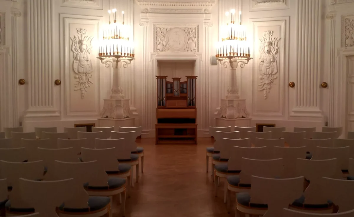
Tour to the Concert
The Petrovsky Travel Palace was built in the late 18th century and served members of the imperial family as a luxurious rest stop on the journey between St. Petersburg and Moscow.
Organ seasons started here in 2013. In essence, they became a continuation of the concert series held from 2011 to 2013 at the Yauza Palace.
Volostnov’s idea was quite unusual for Moscow in the early 2010s: the concert became both a way to introduce the public to organ music and to reveal the interiors of one of Moscow’s most exclusive historical buildings.
the ELEMENTS
Visual Identity
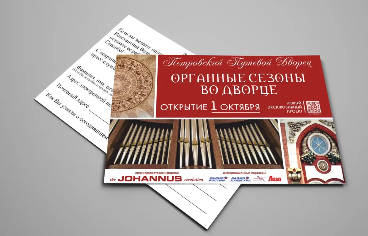
The design draws visual material directly from the palace’s architecture and interiors. This became part of the project’s artistic concept, rather than just a pretty backdrop.
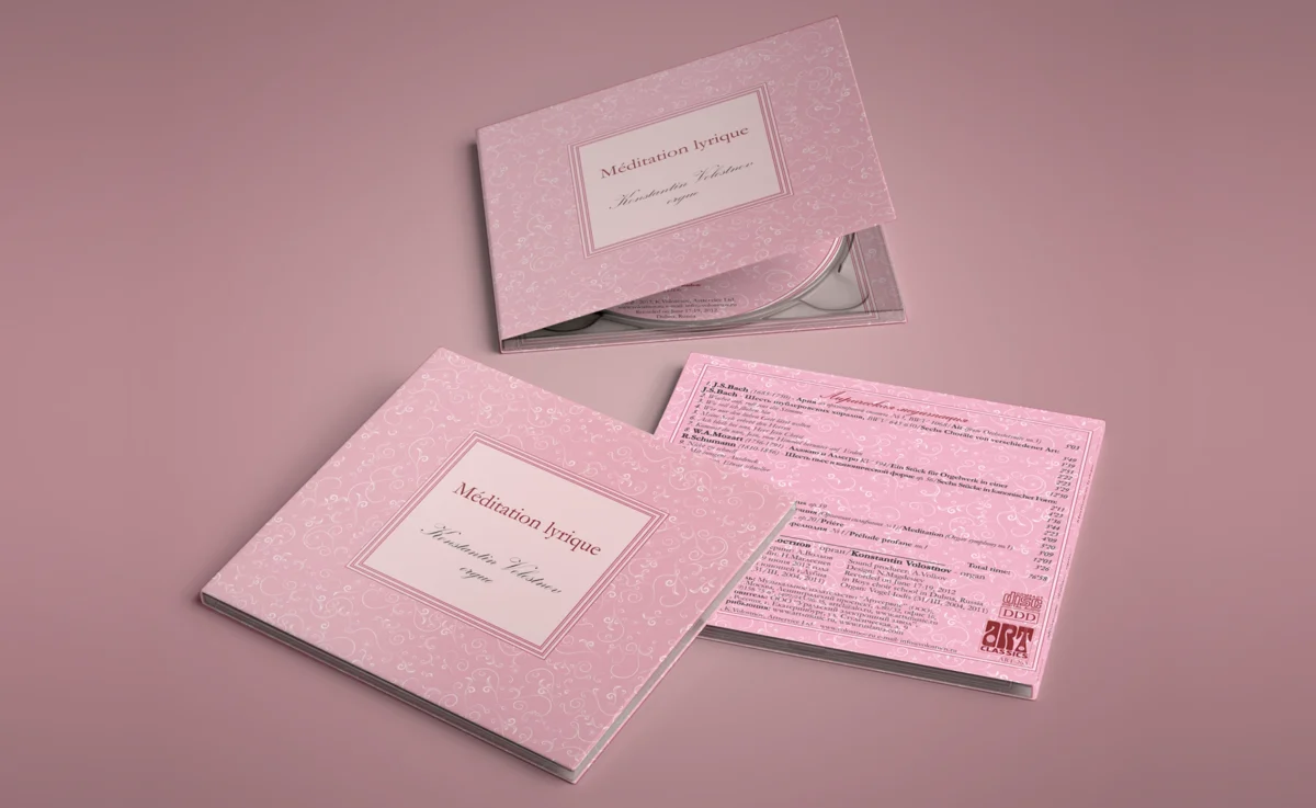
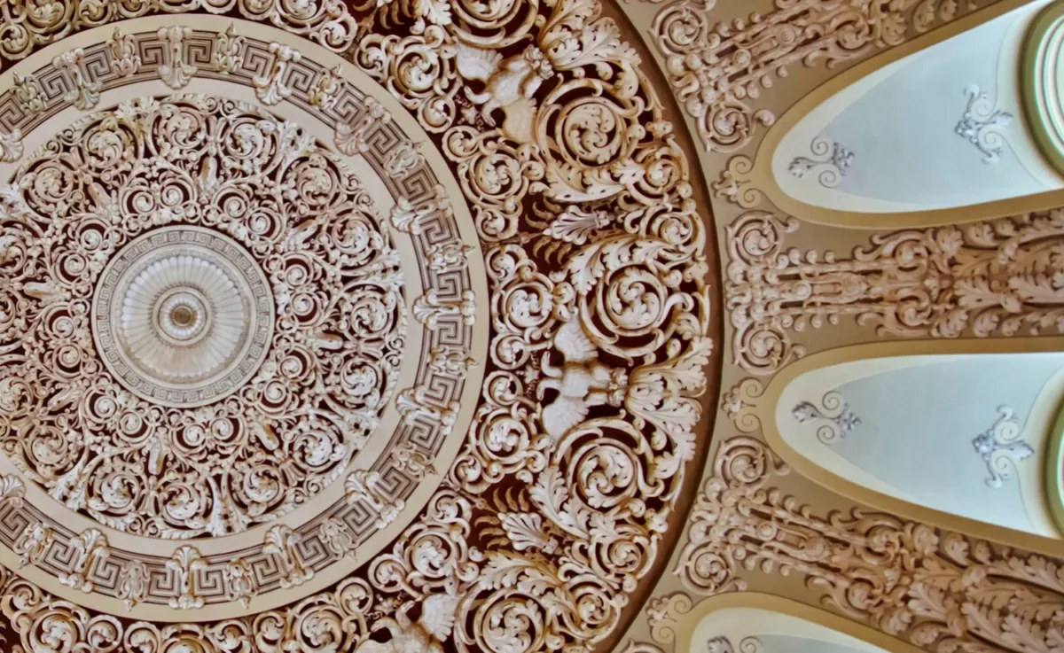
A fragment of the Dome Hall ornament serves as the signature pattern—intentionally rich and slightly theatrical. Interestingly, the dome’s original decor featured stucco work, which was replaced during post-1812 war restoration with grisaille painting that mimics three-dimensional stucco elements.
Volostnov effectively discovered a new function for the historical building that was not intended during its construction: an intimate organ concert hall.
the BRANDING
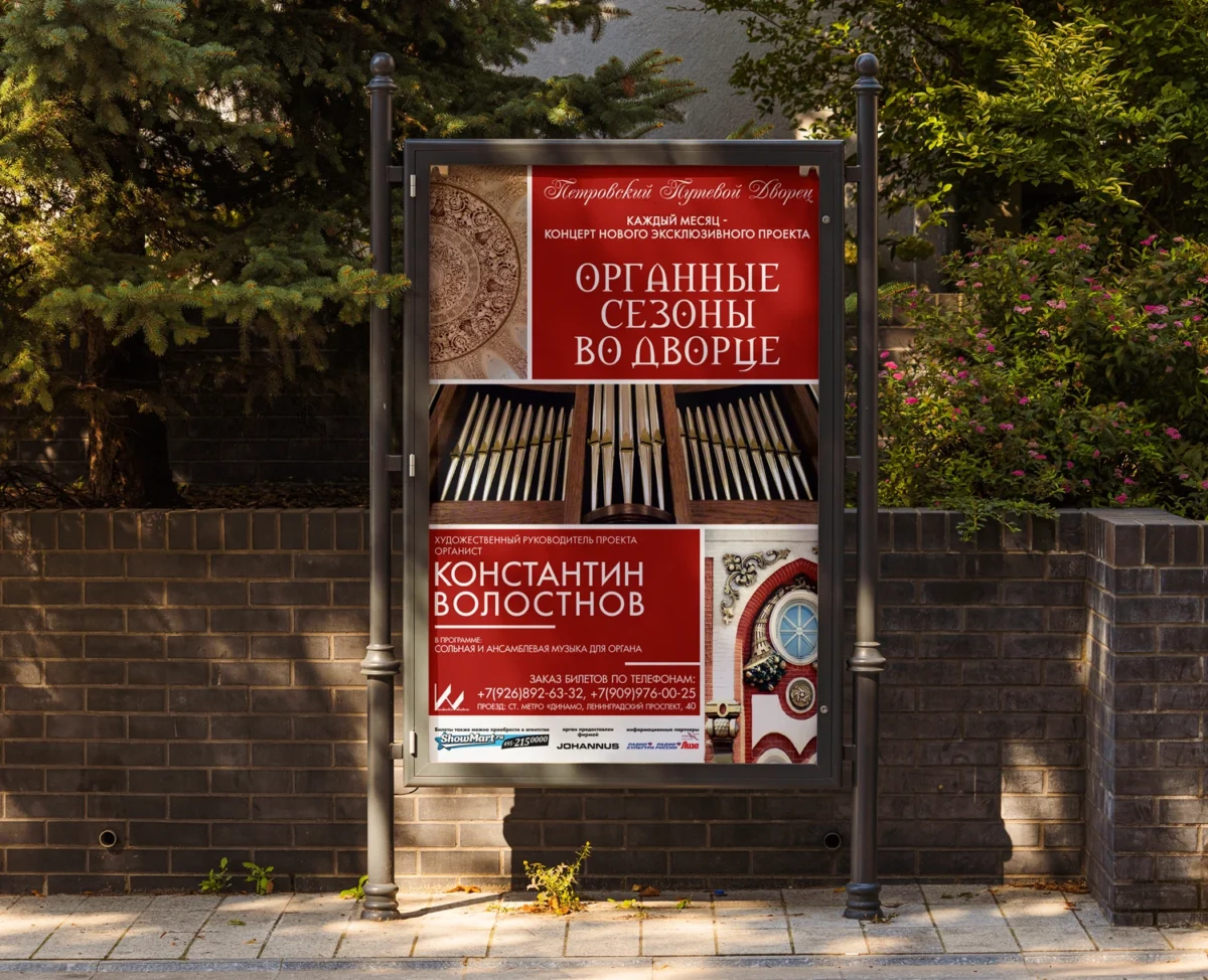
The concept visually connects three elements: the Petrovsky Palace, the organ, and the concert series. The red color virtually becomes the brand’s backdrop, blending seamlessly with the brick-red architectural elements of the palace itself.
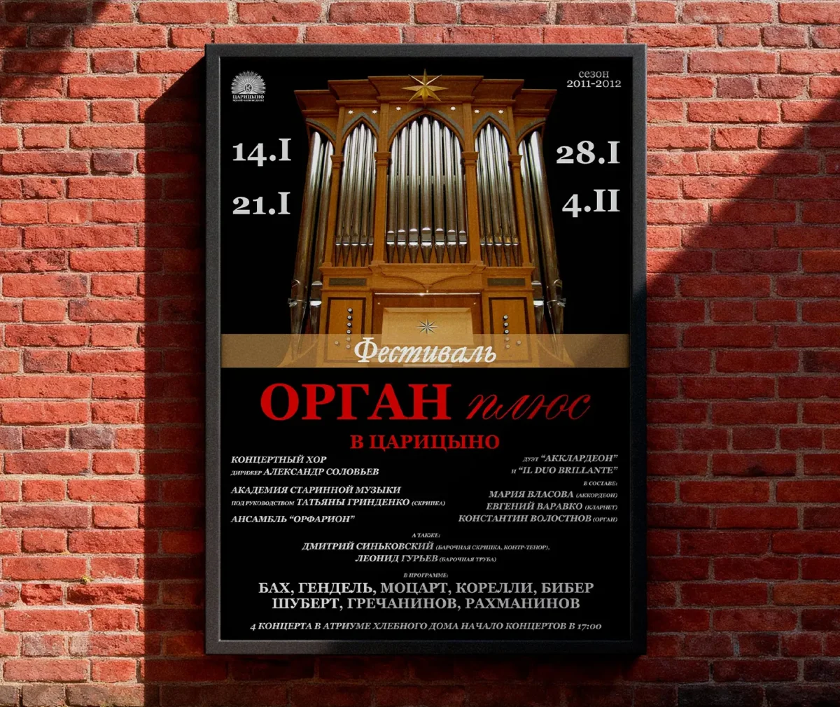
The typography combines two distinct time layers: a decorative calligraphic font representing the historical palace, and a sleek poster font representing the modern concert project. A large fragment of vertical organ pipes was chosen to provide a strong contrast to the horizontal text blocks.
Against the urban backdrop, the poster stands out effectively — the design is crafted not only for viewing on a screen or in hand, but also for instant readability from a distance.
Format Adaptation
Printed flyers were created to promote the concert series offline, while dynamic banners were produced for online advertising.
The digital banner is an example of how the visual system adapts to the shape of the medium. Just like the flyer, it retains all key design elements: the ornament, brand background, typography, and additionally incorporates a panoramic photo of the palace.
Both elements made it easy to update information for upcoming concerts, while the flyer doubled as a mini-survey for audience members wishing to receive newsletters announcing future performances.

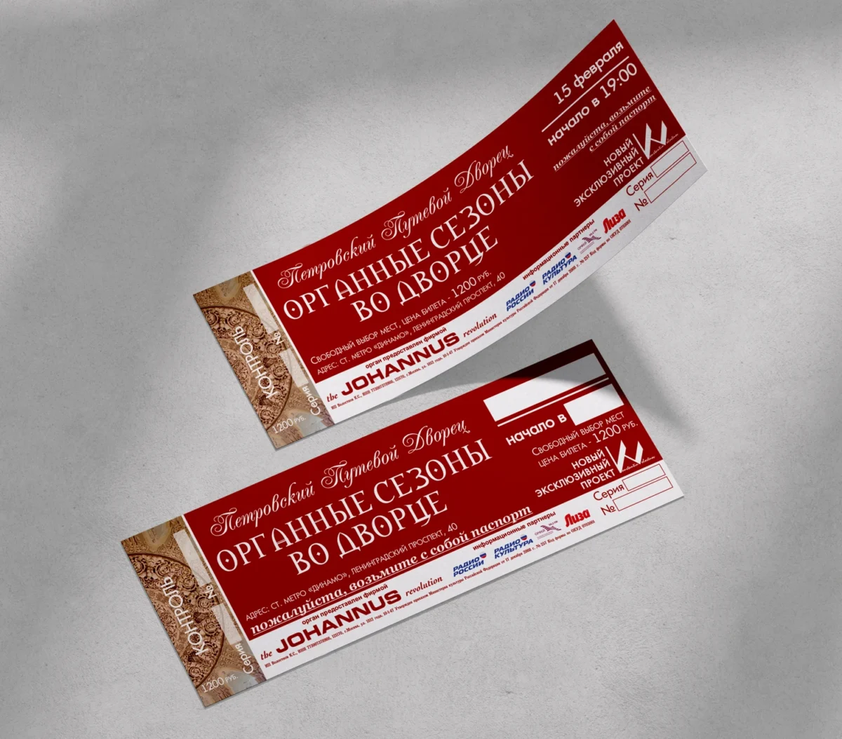
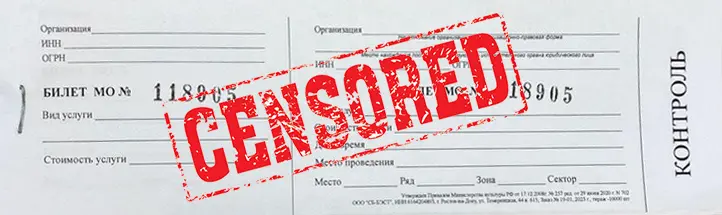
The admission tickets for this concert series naturally extended the visual system: the ornament, brand red color, and typography all serve as a constant identifier. Only the information blocks change for each upcoming concert.
The principle of 80% constant visual language + 20% variable information allows dozens of concerts to be launched without designing from scratch every time.
A resilient visual code was established for this concert series, designed to be adapted across various physical and digital media: posters, tickets, flyers, banners, and outdoor advertising.