

the STORY
Album history and recording location
Recorded on the organ of the “Dubna” Children’s Choral School in the Moscow Region, the album conceptually differs from other releases in the discography of organist Konstantin Volostnov.
Contrary to stereotypes about the monumental and strict sound of the organ, this CD is dedicated to the delicate, intimate, and lyrical side of the instrument.
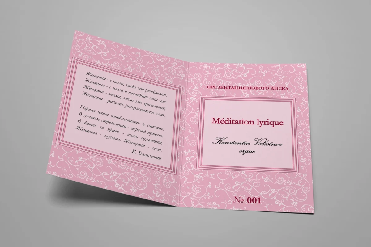
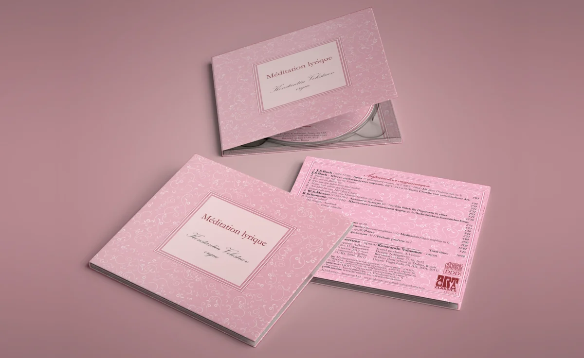
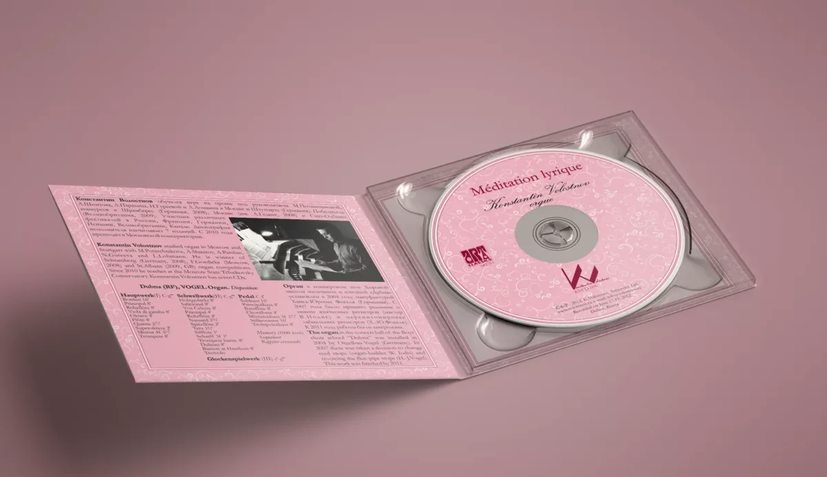
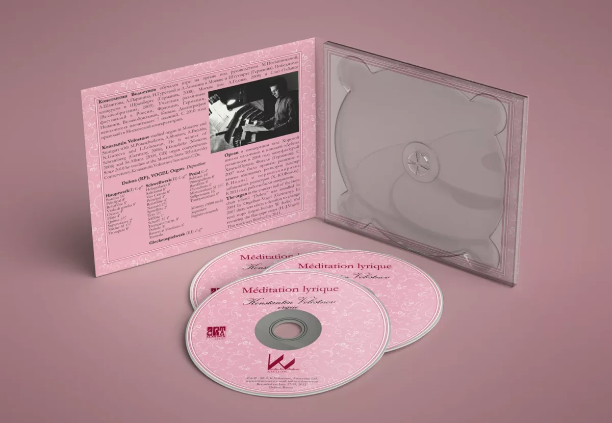
The edition features a delicate, sophisticated design in pastel pink tones with vintage floral patterns, highlighting the romantic and contemplative mood of the music.
the IDEA
Marshmallow rebel
The CD design intentionally departs from heavyweight perceptions of organ music, combining romantic decorativeness with classic typography.
A strict square text block with a contrasting burgundy frame resembles an antique music box, while the ornament — its melody. This visual technique refers to the 19th-century aesthetics and the romantic tradition closely linked to the album’s repertoire.
Thanks to the typographic contrast between a classic serif font and an elegant calligraphic script, the cover is perceived simultaneously as a music album and an exquisite artifact of the Romantic era.
the PACKAGING
A pleasant gift
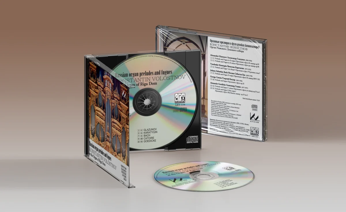
The album is released in a digi-pack format — a folding cardboard packaging for a single CD, which makes the cover an extension of the album’s artistic concept, rather than just a protective case for the disc.
For Méditation lyrique, the digi-pack serves not only as practical packaging but also as part of a gift presentation — there is no need to wrap the disc in gift paper before presenting it to music lovers.
the IMPRESSION
A feast for the soul
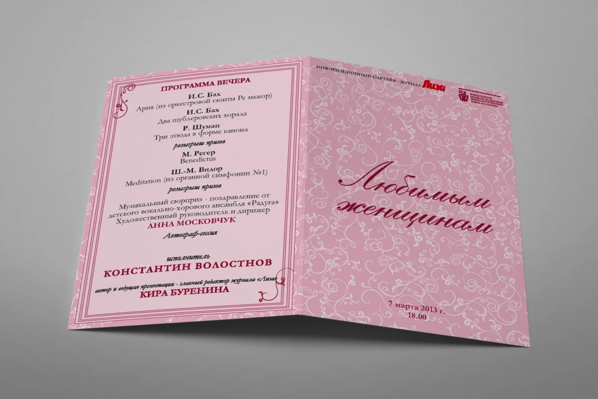
On March 7, 2013, on the eve of International Women’s Day, the new CD was presented at the Glinka Museum in Moscow.
Konstantin Volostnov performed excerpts from the CD’s program and shared the concept behind this unusual album.
Every woman attending the evening received the CD as a gift. The concert was hosted by the then-editor-in-chief of “Lisa” magazine, writer Kira Burenina.
The CD packaging became part of the presentation’s concept — organizers specifically highlighted its pink color, linking the design to the relaxing, lyrical nature of the music.
The concert program was designed as a greeting card with a number for a prize draw and other surprises for the evening’s guests. The invitation tickets were designed in the same style.